Pallote
React component library
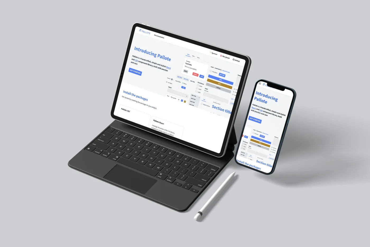
I built Pallote to support my own projects and deepen my understanding of design systems. It started as a need for consistent, accessible components across client work—cards, buttons, inputs, navigation—without reinventing the wheel each time. The library evolved into two packages: a standalone CSS foundation and a React layer that wraps it. The result is a simple, stylish toolkit that I use in production and that others can adopt, with documentation, Storybook, and Figma resources to match.
Pallote was born from a desire to build faster and learn deeper. By building a large scale component library, I can experiment and implement things that would be useful for client projects.

I structured Pallote around two layers. Pallote CSS provides the styling foundation: variables, utilities, and component classes that work in any context. Pallote React adds pre-built components—buttons, cards, inputs, sections, grids—that wrap the CSS with sensible defaults and accessibility built in. The goal was clarity over complexity. Each component exposes a small, predictable API. Typography, spacing, and colour are driven by design tokens, so customising the look means changing a few variables rather than fighting specificity.
Why Open Source
Pallote is a passion project. Building it taught me how design systems scale, how to think about component APIs, and how accessibility fits into the pipeline from the start. Sharing it on GitHub means others can use it, contribute, or learn from it—and the feedback loop keeps the library improving.


